


Typography and fonts have become real game-changers in the world of graphics. As a designer, understanding the power of typography and utilizing the right fonts can greatly impact your designs' visual appeal and effectiveness. Fonts can evoke emotions, convey messages, and create a distinct personality for your brand.
Understanding Typography
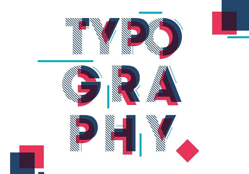
Typography is the art and technique of arranging type to make written language legible, readable, and visually appealing. It involves selecting the right typeface, font size, line spacing, and letter spacing to create a harmonious and balanced design. Typography plays a crucial role in graphic design as it sets the tone and style of your visual communication.
Regarding typography, it's important to consider factors such as readability, hierarchy, and consistency. Readability refers to how easily the text can be read, while hierarchy determines the visual order of importance. Consistency ensures that the typography across your design maintains a cohesive look and feel.
The choice of typeface is also crucial in typography. Serif fonts, with their small decorative strokes at the ends of letters, are often associated with tradition, elegance, and formality. On the other hand, sans-serif fonts, without the decorative strokes, convey modernity, simplicity, and informality. Choosing a font that aligns with the message and personality of your design.
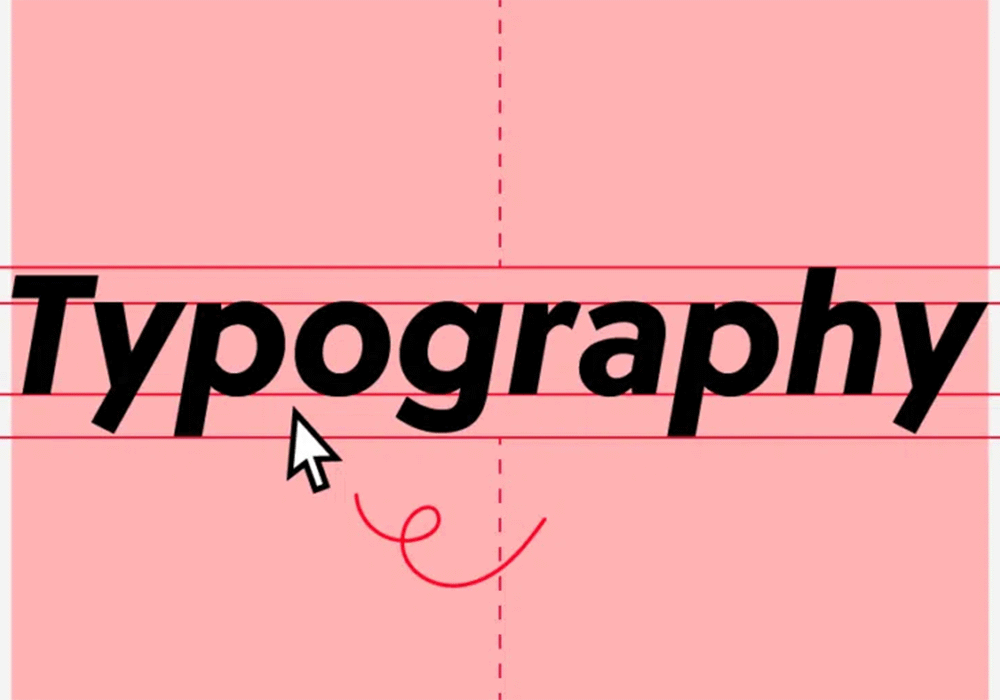
The Psychology Of Fonts
Fonts have the power to evoke emotions and influence perception. Different fonts can convey different moods and feelings, creating a subconscious reaction in the viewer. For example, a bold and heavy font can evoke a sense of strength and power, while a delicate and flowing font can evoke a feeling of elegance and romance.
Typography and fonts also play a crucial role in branding. When designing a logo or creating a brand identity, the choice of font can communicate the values and personality of the brand. Take the iconic Coca-Cola logo, for example. The timeless cursive font instantly evokes feelings of nostalgia and classic Americana. Similarly, Nike's bold and geometric font in their branding exudes strength and athleticism.
Understanding the psychology of fonts allows designers to make intentional choices that align with the desired emotional response from the audience. By selecting the right font, designers can effectively communicate the intended message and create a memorable brand identity.
Choosing The Right Font
Choosing the right font for a design project involves considering various factors. One of the key considerations is the target audience. Understanding the preferences and expectations of the audience can guide the font selection process. For example, a playful and whimsical font might be suitable for a children's book, while a clean and professional font would be more appropriate for a corporate website.
Another important factor to consider is the context in which the font will be used. For web design, selecting fonts that are web-safe and easily readable on different devices and screen sizes is crucial. Factors such as ink absorption, legibility at different sizes, and compatibility with printing techniques need to be considered in print design.
It's also important to consider the overall design aesthetic and the message you want to convey. Whether it's a sleek and modern sans-serif font for a minimalist website or an elegant script font for a luxury brand logo, the typography you choose sets the tone and style for your design.
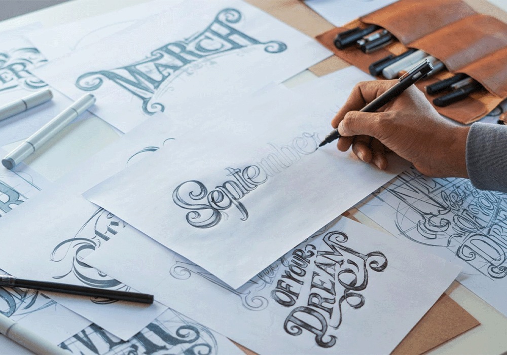
Typography Trends
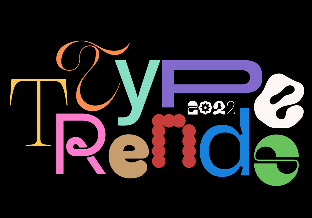
Typography, like any other design element, is subject to trends. Staying updated with the latest typography trends can help designers create fresh, visually appealing designs. Some popular typography trends include:
- Handwritten and script fonts: These fonts add a personal and human touch to designs, creating a sense of authenticity and warmth.
- Bold and oversized typography: Using large and bold fonts can create impact and draw attention to key messages or headlines.
- Variable fonts: Variable fonts allow designers more control over the weight, width, and other attributes of a typeface, providing greater flexibility and customization options.
- Retro and vintage fonts: These fonts evoke a sense of nostalgia and can be used to create a vintage-inspired design aesthetic.
- Minimalist typography: Minimalist typography focuses on simplicity and clean lines, creating a modern and sophisticated look.
It's important to use typography trends judiciously and in a way that aligns with the overall design goals and brand identity.
Examples Of Typography In Branding

Typography is crucial in establishing a brand's identity and creating brand recognition. Let's take a look at a few examples of successful brands that have effectively used typography in their branding:
- Coca-Cola: The iconic cursive font used in the Coca-Cola logo is instantly recognizable and evokes feelings of nostalgia and classic Americana. The font has remained largely unchanged since its inception, demonstrating the power of consistency in branding.
- Google: Google's logo features a custom sans-serif font called “Product Sans.” The font is clean, simple, and playful, reflecting Google's brand personality and its focus on simplicity and innovation.
- Airbnb: The Airbnb logo features a custom-designed font called “Cereal.” The font is modern, friendly, and versatile, reflecting the brand's commitment to creating a welcoming and inclusive travel experience.
These examples demonstrate how typography can create a distinct and memorable brand identity.
Typography In Web Design
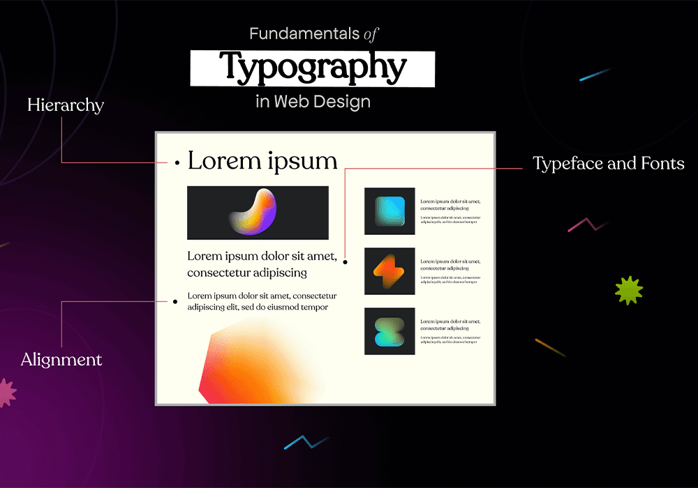
Typography plays a critical role in web design, as it directly impacts the user experience and readability of the content. Here are some best practices for using typography in web design:
- Choose web-safe fonts: To ensure consistency across different devices and browsers, selecting fonts that are widely supported and can be rendered correctly is important.
- Consider legibility: Select fonts that are easy to read, especially on smaller screens. Attention to font size, line spacing, and contrast to enhance readability.
- Use hierarchy: Establish a visual hierarchy by varying font sizes, weights, and styles to guide the reader's attention and communicate the importance of different content elements.
- Limit font choices: Using too many different fonts can create a more coherent design. Stick to a limited number of fonts to maintain consistency and visual coherence.
- Optimize for loading speed: Use optimized web fonts for performance to ensure fast loading times and a smooth user experience.
By following these best practices, designers can create visually appealing and user-friendly websites that communicate the desired message.
Typography In Print Design
Typography is equally important in print design, as it contributes to printed materials' overall aesthetic and readability. Here are some tips for optimizing typography for print:
- Consider the medium: Different printing techniques, such as offset or digital printing, can affect how fonts appear on the final printed piece. Take into account factors such as ink absorption and resolution when selecting fonts.
- Pay attention to sizing: Fonts that are too small or too large can negatively impact readability. Ensure that the font size is appropriate for the medium and audience.
- Mind the spacing: Proper spacing between letters, words, and lines is crucial for readability. Pay attention to kerning (the space between individual letters), leading (the space between lines of text), and tracking (the overall space between letters).
- Choose appropriate font weights: Different font weights can create visual contrast and hierarchy in printed materials. Use bold or italic variations to emphasize important information or create visual interest.
- Use grids and alignment: Grids and alignment help create a sense of order and structure in print design. Aligning text elements to a grid can improve visual balance and readability.
By considering these tips, designers can ensure that typography enhances the impact and effectiveness of printed materials.
Tools And Resources For Typography
Finding the right fonts and experimenting with typography can be made easier with the help of various tools and resources. Here are some useful tools and websites for typography:
- Google Fonts: A vast library of free and open-source web fonts that can be easily integrated into web design projects.
- Adobe Fonts: A collection of high-quality fonts available through Adobe Creative Cloud allows designers to access a wide range of fonts for web and print design.
- Font Pair: A website that offers curated font combinations to help designers find complementary fonts that work well together.
- Canva: A popular graphic design tool that provides various fonts and typography templates for creating professional-looking designs.
- Typewolf: A website that showcases beautiful typography examples and provides inspiration for designers.
Using these tools and resources allows designers to expand their font choices and experiment with different typographic styles.
Conclusion
Typography and fonts are indeed game changers in the world of design. From evoking emotions to conveying messages and enhancing readability, typography is crucial in creating visually appealing and effective graphics. As a designer, understanding the power of typography and selecting the right fonts is essential for creating impactful designs.
By mastering the art of typography, designers can leverage the psychological impact of fonts to create memorable branding, enhance user experiences in web design, and optimize readability in print design. So, embrace the power of typography and fonts, and let them be your allies in creating visually stunning and engaging graphics.